User Experience: 6 Key Updates in Transferra iOS App
Explore the strategic benefits of the Transferra iOS app. Uncover how our redesigned interface enhances currency exchange and financial management with ease.
We’re excited to share the release of an updated version of our iOS app, designed with the user at its core. The redesign focuses on delivering a more intuitive, efficient, and personalised mobile platform for managing your finances. Our goal was to create an effortless user experience that meets the needs of our customers, such as simple navigation and efficient functionality. The app supports two-factor authentication and biometric access for enhanced security. You can also switch between accounts with ease.
Whether you’re an IT company owner, a footwear retailer, a steel exporter, or a relocation lawyer, Transferra’s iOS app offers a suite of features developed to simplify your financial life.
Dashboard screen: quick and convenient access to account information and payment transactions
The dashboard interface is designed for intuitive navigation, making it easy to switch between your cards, payment activities, and profile data. A key focus is on displaying your overall balance upfront, giving you an instant view of your financial status. Additionally, accounts are neatly organised into currency-specific sections, further simplifying the presentation of information and improving the user experience.
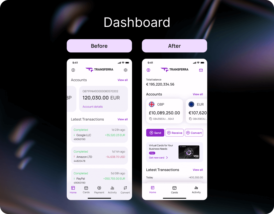
How can you manage your payments and transactions within the Transferra iOS app using the dashboard?
Total balance
Take an immediate understanding of your total financial situation, a crucial metric for businesses of all sizes!
Knowing your total balance helps you see how prepared your company is for unexpected expenses or new opportunities. It might be time to consider attracting new investors or refinancing existing loans. How do your actual amounts compare with your planned figures? Identify gaps and take timely action!

Example: Imagine the owner of a small IT firm wants to expand their developer team. Before making the decision to hire new employees, they can open the Transferra iOS app and see that the company’s total balance is sufficient to cover the additional salary costs for several months. This gives them the confidence to move forward with the expansion.
Multi-currency accounts
Manage accounts in various currencies!
A business owner frequently faces challenges with handling cross-border transactions, such as dealing with suppliers from different countries and paying for inventory. Does managing import/export fees and overseeing multiple stores across regions seem overwhelming? With a multi-currency accounts feature, the owner can conveniently view all balances in several currencies in one place. This enables them to oversee and coordinate these financial activities, ensuring that funds are available where and when they’re needed. If the businessman sees that they have a significant amount in euros but urgently require more funds in pounds, they can swiftly convert some euros to pounds, optimising the cash flow.
This update is particularly timely, as a recent publication by the President of the European Central Bank highlights the diversification of global reserves, noting a decrease in the euro’s share and an increase in other currencies. This underscores the growing importance of effectively managing multi-currency accounts, especially with the rising significance of non-traditional units in global portfolios.

How does a multi-currency account simplify managing finances across different currencies?
Example: Let’s say a shoe chain owner with offices in Germany and the UK reads The World Bank’s Global Economic Prospects study highlighting exchange rate volatility as a key challenge for multinational corporations. While checking their multi-currency balances, they notice that the fee for converting euros to British pounds has increased, indicating that the euro may have weakened against the pound. This change makes acquiring shoe fillers from Germany more cost-effective. As a result, they decide to increase inventory orders from Germany while reducing purchases from countries with stronger currencies.
Quick actions: send, receive, convert within the Transferra iOS app
Send payments or convert currencies with just a few taps!
Want to simplify your financial management? By having these functions right on the main screen, Transferra iOS app eliminates the need for navigating through multiple menus. This means you can perform currency conversions, send or receive payments, and manage your finances with minimal effort.

How to quickly convert currency using the Transferra iOS app?
Example: Imagine an international trade manager needs to pay a supplier in China for a new shipment of steel pipes. Using the Send button, they quickly transfer the required amount in CNY. At the same time, they collect a payment from a Montenegrin client and immediately verify the funds by tapping the Receive button. The exporter notices that the CNY to EUR rate is favourable and decides to use the Convert button to exchange part of their CNY reserves into EUR, taking advantage of the rate to optimise their financial position.
Virtual cards access
Generate unlimited virtual cards for security and flexibility!
With only a couple of clicks, you can create an unlimited amount of virtual cards. How about clearly separating your business expenses? The interface lets you track expenditures for specific projects or departments. For instance, for travel, advertising campaigns, or the purchase of materials, a special card can be set up. Each of them comes with its own transaction history, simplifying the process of accounting and cost analysis.

How can Transferra virtual cards enhance your payment management?
Example: A relocation lawyer frequently deals with various client-related expenses like booking flights, paying for accommodation, and renting vehicles.Using virtual cards assigned to every specific category simplifies this process by eliminating the need for multiple invoices and receipts, as all transaction details are accessible electronically. Clients benefit from detailed reports, leading to transparency and confidence in the lawyer’s services.
Latest transactions
Stay informed about your recent transactions!
This feature allows you to quickly assess recent financial activity without additional navigation. The updated latest transactions interface also highlights entries that have not been processed or debited from your account by displaying them in grey. This is particularly useful for businesses that need to reconcile accounts frequently. For someone in a fast-paced industry, having instant access to your most recent transactions is not just a convenience — it’s a necessity.

How to clear transaction history in the Transferra iOS app?
Example: The owner of an international restaurant chain manages numerous small payments and monitors expenses for food products and operations across multiple locations. By reviewing the latest transactions, they can verify the accuracy of payments made to suppliers and service providers. This insight can inform decisions on whether to continue, renegotiate, or seek alternative suppliers based on their financial history.
The redesigned dashboard of the Transferra iOS app goes beyond just overseeing your finances — it also offers quick entry to your profile and personalised customer support. Whether updating your details or contacting your dedicated personal manager, these options are just a tap away, ensuring you have help exactly when you need it.
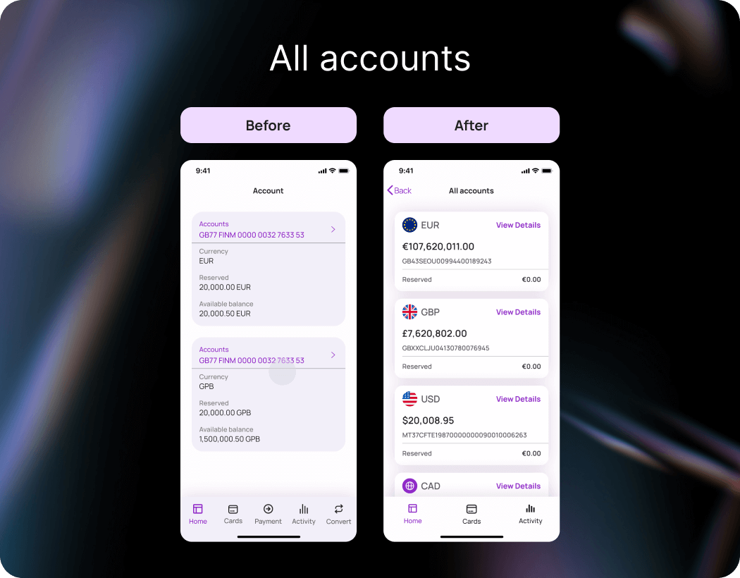
On the All accounts interface, we’ve added currency icons to reduce cognitive load and better user perception. This visual improvement facilitates faster navigation. Each currency is now presented in a separate block with a clear indication of the balance, reducing the likelihood of errors due to inattention to details. A ‘View Details’ button has appeared to provide easy access to additional information while keeping the main interface uncluttered. We’ve also enhanced contrast and used more vibrant colours for easier text readability and better differentiation.
In the updated Currency exchange screen, we divided the key information — rates, available balances, and commissions — into sections to enhance comprehension. How does this new layout help you better understand your currency transactions, including B2B money transfers? Elements are highlighted with colour and size, and currency symbols like EUR or GBP next to the relevant amounts make it easier to identify the currencies at a glance. These changes contribute to a more pleasant experience.
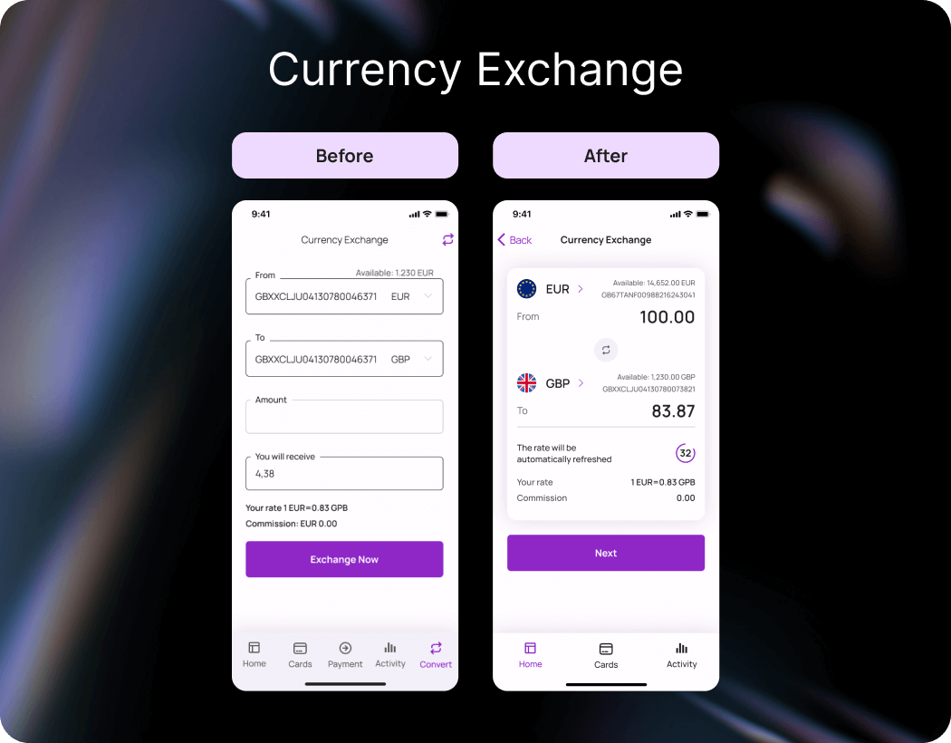
How to convert currencies in the Transferra iOS app?
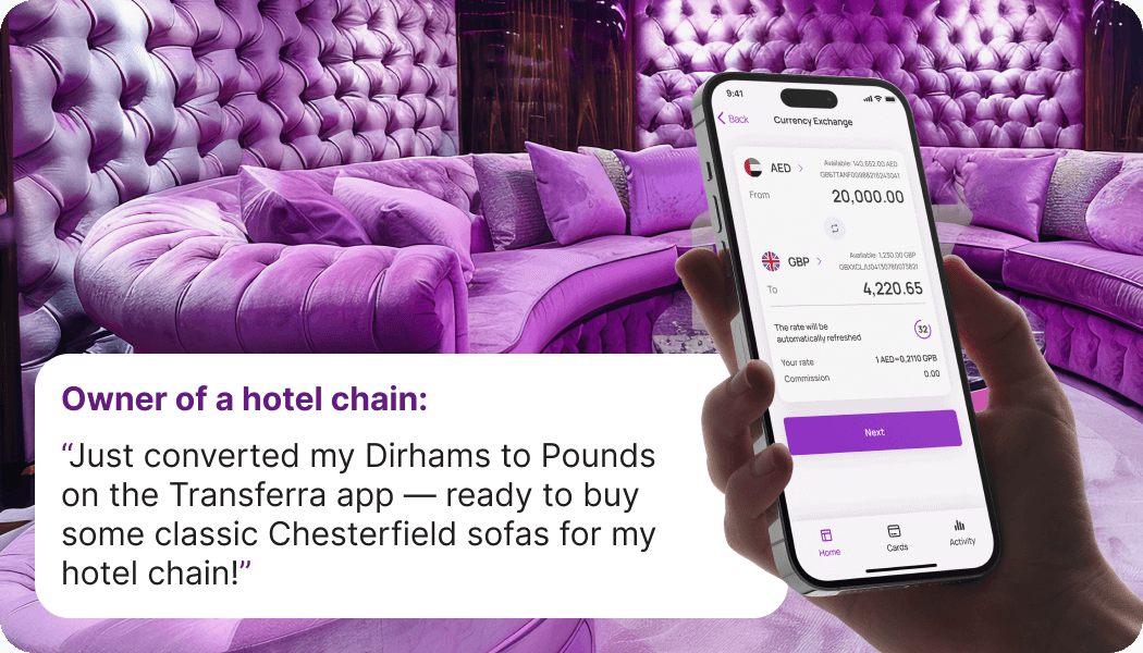
Example: The owner of a hotel chain in Singapore and the UAE needs to regularly move large sums of money between SGD, AED, and GBP to pay suppliers. The owner notices that the majority of the available balance is in AED, but they need to make a payment to a UK-based supplier for hotel furnishings. They use the updated Currency exchange feature to quickly switch the necessary amount from AED to GBP.
My profiles screen: improved visual hierarchy
In the redesigned option of My profiles interface, you can see their full name, ID, email, and other relevant details all in one place. There is a clear visual hierarchy with the use of icons, colour differentiation, and more thoughtful spacing. It’s not just about aesthetics — these changes make settings more distinct and, frankly, a lot easier to find. This means users can understand their profiles quicker without feeling lost in a maze of options. The consolidation of account information into one screen reduces the number of steps required to access key info.
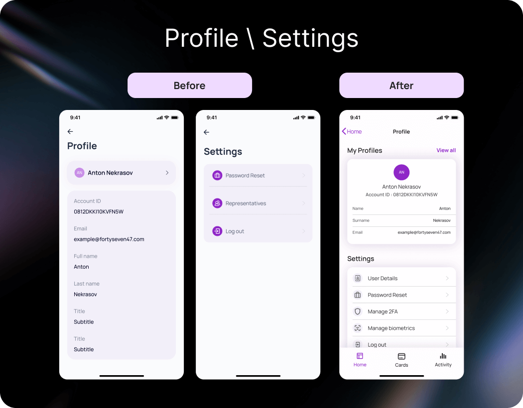
How does the visual hierarchy enhance the user experience in managing account details?
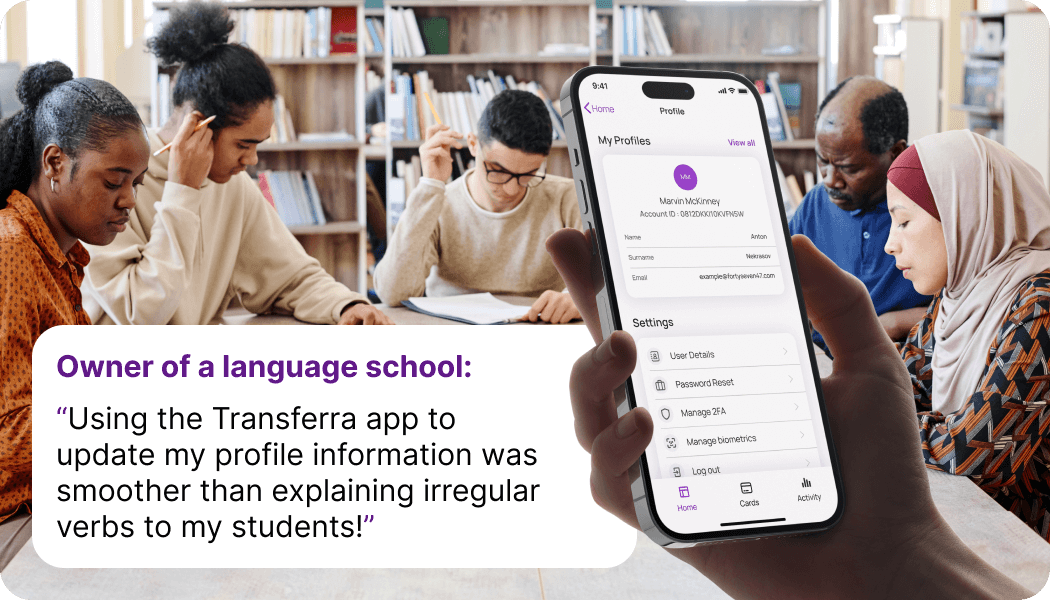
Example: A Lithuanian language school owner opens their Transferra iOS app to update their residency status, as the old information is now outdated. When they land on the My Profile screen, they’re immediately presented with the most essential details, not buried under layers of unnecessary information. They quickly locate the section to make the necessary changes with minimal hassle. The process is smooth, leaving the business owner confident that their financial transactions will now proceed seamlessly, allowing them to focus on other aspects of managing their school.
Activity screen: advanced UX
In the updated Activity interface, users can quickly navigate their spending across different periods. The search bar allows them to find specific transactions without scrolling through long lists. Coloured indicators distinguish between income and expenses. Plus, the larger and clearer text reduces eye strain, making it more comfortable for everyone to use, regardless of their vision.
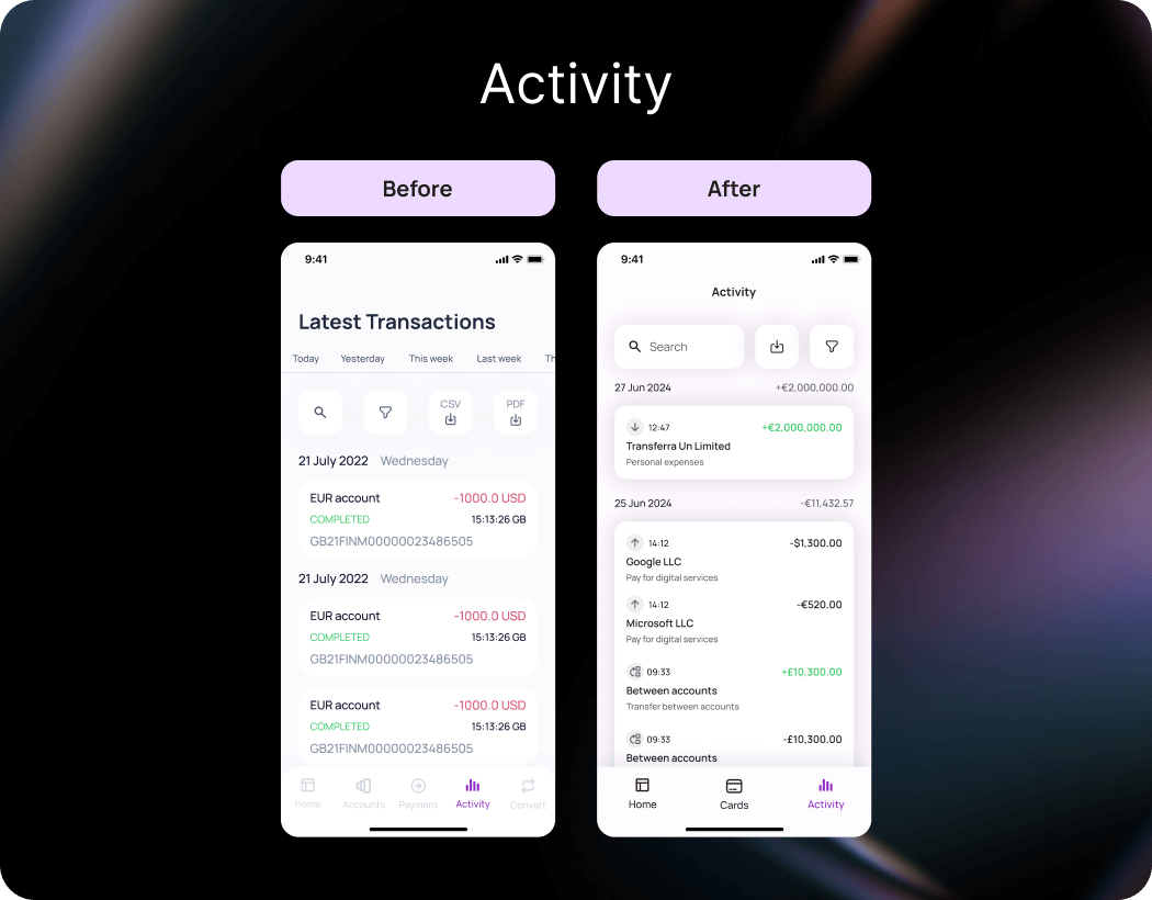
In what ways does the user interface improve the ease of use when handling payments and transactions?
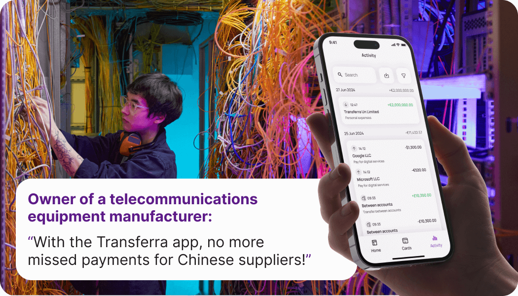
Example: The owner of a telecommunications equipment company receives an urgent notification on August 22nd from a key supplier in China. The supplier hasn’t received payment for a shipment of electronic components that was due by August 20th, and it’s crucial for the ongoing project. Panicked but determined, the owner heads to the Activity section of the Transferra iOS app. They quickly use the new search bar to locate the transaction, download the details, and promptly send them to the supplier to sort out the issue. Thanks to these interface updates, resolving the payment mix-up is swift and hassle-free.
Virtual cards screen: optimised arrangement of elements
In the updated Virtual cards interface, buttons for managing options such as “Details”, “Replace”, “Block”, and “Delete” have become more visible and easily accessible, making them simpler to use. This helps you quickly find the functions you need. Those who have many cards and wish to identify them will find the new “Rename card” option very useful since it allows them to do just that. The contrast between text and background has been improved, reducing eye stress.
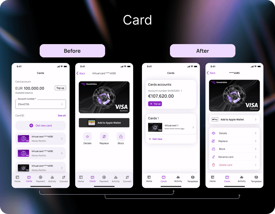
How to set up multiple corporate card management to optimise costs in the Transferra iOS app?
Example: Sarah, the owner of a growing transportation company, faced a challenge with managing several corporate cards issued for various fuel suppliers. To make them easily identifiable, she decided to label them with names like “Fleet Fuel – Logistics” and “Fleet Fuel – Maintenance”. This simple change allowed her to optimise company expenses by centralising purchases, negotiating better rates with suppliers, and reducing administrative overhead associated with many accounts.

Log In / Sign Up screens: intuitive process
The changes to the design of the login and registration interfaces within the Transferra mobile app are aimed at enhancing the user journey. The flow is now divided into several stages, making navigation easier and less stressful. Step numbers and a progress indicator assist in tracking your current progress. The availability of prompts for password recovery and support contact provides reassurance. Clearer instructions reduce mistakes when entering data. Registration and login are conducted via phone number, simplifying the experience, especially for international users.
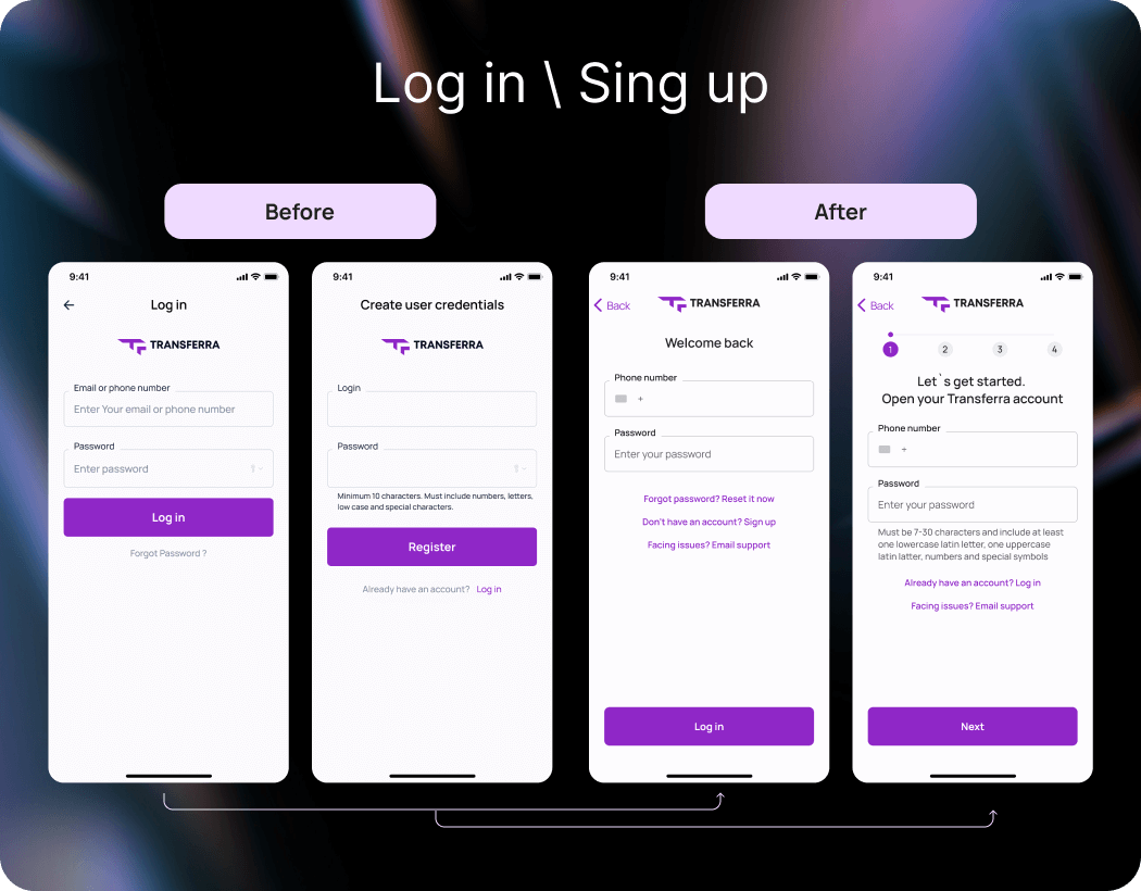
How do the user experiences of the sign-up and log-in processes differ in the Transferra app?
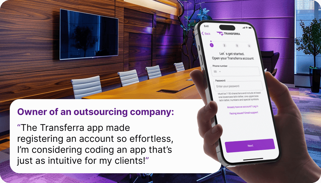
Example: An outsourcing company owner from Eastern Europe sought a reliable payment solution for dealing with foreign clients. Upon opening the Transferra app, they were greeted with a clear, step-by-step registration process with straightforward instructions that reduced overwhelm. As a result, they quickly set up the IBAN account and began using the app to administer client invoicing and track financial transactions.
About Transferra
Transferra, a fintech company based in the UK, is dedicated to offering an intuitive platform for managing business finances. We offer multi-currency accounts with individual IBANs, quick and secure money transfers to over 180 countries in 30 currencies. Our mission is to provide modern, accessible financial tools to help small and medium-sized enterprises thrive. With Transferra, users benefit from seamless online banking, transparent currency conversion, and personalised support from our expert team.

